
Makeup · The DragSale journal
Drag Contouring Techniques: Shape, Placement and Fixes That Make Sense
Learn where to place drag contour, choose shades for your skin tone, blend without losing shape, and fix muddy, patchy or overly harsh results.

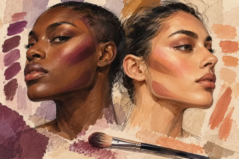
If your contour looks convincing in one mirror angle and like a brown stripe everywhere else, the answer is rarely “blend harder.” Usually the colour, placement or size of the shape needs changing.
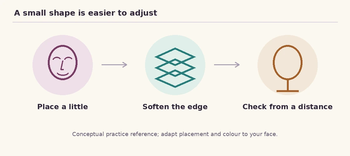
Good drag contouring creates deliberate contrast: place shadow where you want depth, keep lighter areas where you want emphasis and soften the boundary without erasing the shape. Start smaller than your intended result, check it with your head upright and judge it at the distance your audience will see you.
You can use contour to suggest lifted cheeks, a squared jaw, rounded doll-like features or an exaggerated character. There is no requirement to make a face smaller or more conventionally feminine. This guide helps you choose and execute the effect rather than treating your natural features as a list of faults.
Know what each colour is doing
Matte contour is an imitation of shadow. Matte highlight creates a lighter plane. A reflective highlighter creates shine that moves with the light. Blush adds colour and can reinforce the direction of the whole design. When all four are used indiscriminately, the face can lose structure instead of gaining it.
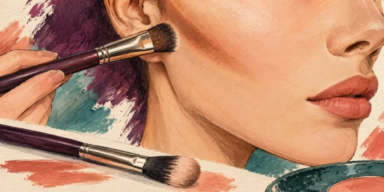
Imagine a cheek divided into three neighbouring areas: a controlled shadow beneath the cheekbone, a lighter or naturally lit area above it and blush connecting the colour to the rest of the face. The boundaries can be soft without every product occupying the same space.
For a rounded character, you might emphasise the front of the cheeks and avoid a long diagonal shadow. For a sharper character, you might create a shorter, more defined cheek plane and a deliberate jaw. Neither is the correct face. They are different design decisions.
If you are still learning the rest of the routine, begin with our drag makeup beginner guide. Contour is easier to control when the foundation underneath is even and not sliding around.
Choose a shadow colour, not just a darker product
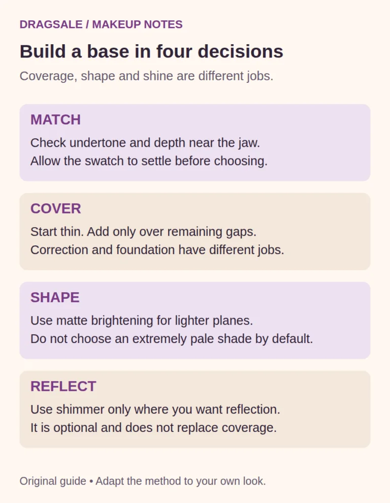
Start by comparing the product with your foundation on your actual skin. You want enough depth to create a visible difference, with an undertone that reads as shadow for your design. “Two shades darker” is only a rough shopping prompt: shade numbering is not standardised, and the jump between two shades can be very different across brands.
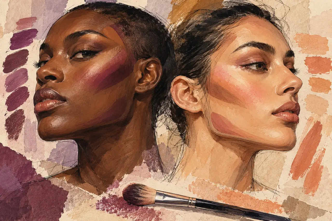
On fair skin, a very warm brown may look orange rather than shadowed. On deeper skin, a pale grey-taupe can look chalky and may not provide enough depth at all. Rich neutral, red-brown or other deeper shades may work better depending on your undertone and the lighting. On olive skin, both overly pink and overly orange options can be distracting. Do not assume a product labelled universal truly is.
Try a small blended patch beside your base, then look from several steps away. If you see a separate colour before you see shape, reconsider the shade or the amount. For theatrical or fantasy makeup, a deliberately unnatural shadow may be exactly the point; make that a choice, not an accidental mismatch.
Bronzer and contour are not interchangeable by definition. Bronzer often introduces warmth or a sun-touched effect, while contour aims to suggest depth. You can use the same product for both if its shade and finish work, but you do not need to buy both simply because they have different labels.
Choose cream, powder or a restrained combination
Cream gives you time to move a shape and can sit naturally within a cream foundation. Powder is useful for building controlled depth over a suitably prepared base. The more important distinction is whether the layer underneath is ready for the next product.
| Approach | Useful when | Watch for |
|---|---|---|
| Cream contour | You want to blend within a cream base | Dragging foundation away with a stiff brush |
| Powder contour | You prefer gradual placement over a set base | Dark patches where powder catches on wet product |
| Cream plus powder | You already know the placement and want extra definition | Doubling the darkness unintentionally |
Use a smaller brush than the final area you want to shade. A large fluffy brush can be useful for a soft finish, but it is a poor tool for placing a narrow line. Keep a separate clean brush or sponge for edge work so every attempt to blend does not add more pigment.
When using powder, remove excess from the brush and touch down gently. When using cream, place a little product from a clean palette or the back of a clean hand rather than drawing a thick stripe directly onto every feature. You can always add more once you have seen what the first amount does.
Place cheek contour in five controlled steps
- Look forward with a relaxed face. Find the cheekbone with your fingers if that helps. Do not depend on a dramatically sucked-in expression; your finished face will not stay in that position.
- Choose the direction. For a lifted effect, begin toward the outer cheek and angle the shadow gently upward. For a rounded effect, keep the front cheek brighter and avoid a long hollow.
- Make a short first mark. Keep the deepest colour toward the outer face. Stop before the mark crowds the mouth.
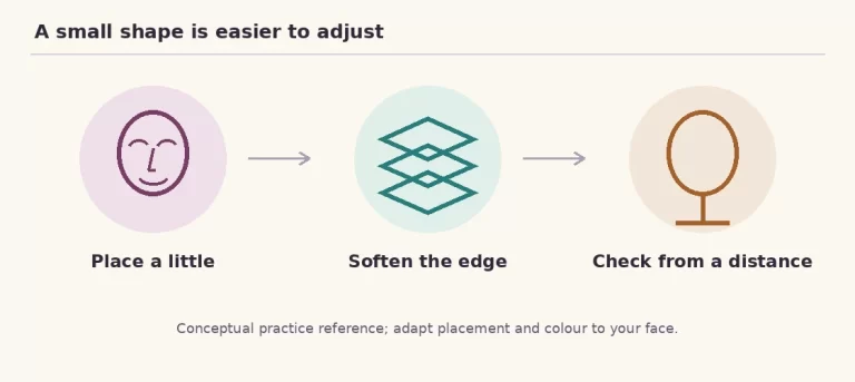
- Soften the upper boundary. Use light tapping or small movements toward the cheekbone. Avoid pulling the shadow downward across the jaw area.
- Step back before adding more. Turn your head both ways and smile. Increase depth only where the shape needs it.
A useful practice is to finish one cheek softly, photograph it, then add a little more depth and photograph it again in the same light. Comparing the two tells you how much contrast your camera or room actually needs. It is more reliable than endlessly darkening both sides because the close-up mirror looks unfamiliar.
Do not demand perfect mirror-image marks. Most faces have natural differences in height and fullness. Aim for a balanced overall effect when looking forward. A slightly different placement on each side may create more visual balance than identical stripes.
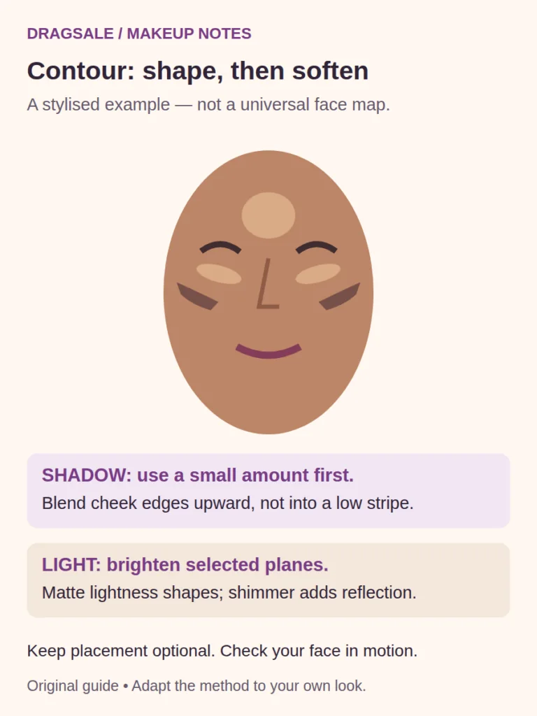
Adapt the nose, jaw and forehead instead of tracing a template
Nose: begin with less than you think
Use a small brush and a light amount. Place a subtle shadow only where it supports the shape you want, then inspect from the front and side. Two heavy parallel lines can look graphic rather than dimensional, especially in daylight. If graphic is your goal, own it; if not, soften and reduce the contrast.
A narrow matte highlight can suggest a central plane, but an extremely bright stripe may draw more attention to the nose. Shimmer on the tip also attracts light. Neither is compulsory. Check that the contour does not end abruptly beside the inner eye or create a dark ring around the tip.
Jaw: choose definition or softness
For a more defined jaw, place shadow with the actual lower edge in mind and blend the boundary into the adjacent area. For a softer effect, use restrained contrast rather than outlining the entire jaw with dark product. If you have facial hair, consider how it already creates depth; adding contour over it may be unnecessary.
Check the face against the neck and costume. A dark band under the jaw can be obvious when you lift your chin. You do not need to cover every exposed inch in foundation, but you do need to notice where the painted design ends.
Forehead: plan around the wig and hairline
Put on or position the wig sufficiently to understand the visible hairline before making a strong forehead shape. Shading an area that the wig covers wastes product; creating a hard line just below it can look accidental. Use small amounts and keep products away from adhesive zones unless the adhesive instructions permit them.
A short forehead does not automatically need shading. A longer forehead does not automatically need hiding. Leave areas alone when more contrast would crowd the design. Restraint is still a technique.
Recent posts
The latest stories and guides from DragSale.




Make highlight and blush work with the contour
Matte highlight needs to relate to your base. A very pale product spread across a wide under-eye triangle can flatten the face and emphasise texture. Start with a smaller area and a moderate contrast, then build only if your stage or character needs it.
Keep under-eye product especially thin where the skin folds. A dense cream layer covered with heavy powder will still move when you smile; it may simply create a thicker crease. Place the brightness where it contributes to the cheek plane, not automatically right up to every lash.
Apply blush after you can see the structure. For lift, try concentrating colour slightly higher and outward. For roundness, try a more central placement without spreading it into a large horizontal band. The best blush depth depends on your complexion and desired impact, not on a rule that everyone needs the same pale pink.
Add shimmer last and deliberately. A small reflective area on the cheek can be striking, but a large glittery stripe can make texture more visible under hard light. That is not a reason textured skin cannot wear shine. It is a reason to choose placement and finish instead of assuming more is always better.
When contour goes wrong, diagnose before adding
| Problem | Possible cause | First repair |
|---|---|---|
| Orange cheeks | Shade is too warm or too saturated for the intended shadow | Lift surplus and test a different undertone |
| Grey or ashy result | Product is too pale or too grey for your base | Restore the base locally and choose suitable depth |
| Dark stripe toward the mouth | Placement is too long or low | Clean the inner end and rebuild a shorter shape |
| Patchy powder | Unevenly wet base or too much product on the brush | Stop layering; smooth or reset the affected patch |
| Contour disappears | Too little contrast, overblending or unsuitable light | Check at viewing distance, then add a small controlled area |
| Muddy face | Highlight, blush and contour occupy the same space | Restore separation instead of blending everything again |
For a cream mistake, a clean sponge may lift some excess. A little of your foundation beside the contour can restore an edge, but keep that repair thin. For a powder mistake, a clean soft brush can remove loose surplus; vigorously rubbing set pigment may damage the base. If the area has become overloaded, a careful local reset is often quicker.
If the shape looked good initially but disappears or separates later, the problem may be wear rather than placement. Use the long-lasting makeup guide to check preparation, layer thickness and friction before blaming your blending.
Practise one design under two kinds of light
Pick one effect—lifted cheek, stronger jaw or rounded character—and repeat it with the same products. Take one photograph in soft neutral light and one in the lighting closest to your planned venue. Keep camera distance and exposure reasonably consistent; beauty filters can hide the exact texture and edges you are trying to evaluate.
For stage work, ask whether the important planes remain visible from farther away. For close conversation, ask whether the edges look intentional when you turn. You may want two versions of the same face: softer for close-up wear and more contrasted for performance.
Write a short placement note rather than a vague verdict. “Outer cheek looked lifted; inner contour reached too far; shorten it next time” gives you an action. “Bad contour” does not. Once placement works, experiment with depth. Changing the map and the formula and the brush simultaneously makes it difficult to learn what helped.
Common drag contouring questions
Do I need both cream and powder contour?
No. One suitable formula can create a complete design. Layering the two is an option for extra definition, not proof that your makeup is more advanced. Learn the placement with one before doubling the products.
Should contour always be cool-toned?
No single undertone works on every complexion. The aim is a convincing shadow or a chosen theatrical colour. A product that looks suitably muted on fair skin may look grey on deep skin. Judge the blended result beside your foundation.
Can I contour without foundation?
Yes, if the formula blends comfortably over your prepared skin and the contrast suits your design. Start lightly; bare skin may absorb or grip product unevenly. Foundation is useful for an even canvas but is not a prerequisite for exploring shape.
How do I know when to stop blending?
Stop when the boundary is intentional and the main shape remains visible at your viewing distance. If the whole cheek is becoming the same colour, you have moved beyond edge-softening into spreading the product. Clean the brush and reassess before continuing.
Try this next: practise one short cheek shape, check it from the front and side, then take a photograph before adding anything else. The most useful contour skill is knowing which small adjustment changes the result.
Find your next guide
A useful answer to the next question.




Recent posts
The latest stories and guides from DragSale.
[…] Professional Makeup Advice: This forum thread on Crossdresser Heaven is a great place to ask all your makeup and skincare questions. […]